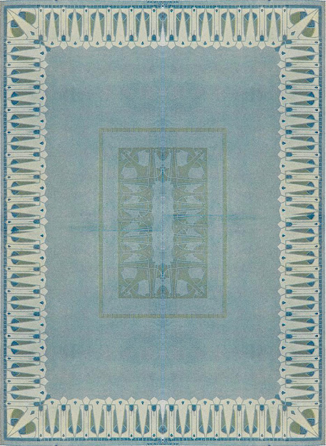
Illustration: Josef Maria Auchentaller. Pattern work, 1901.
A new designer to this site and a new designer to many I should imagine. Josef Maria Auchentaller was a trained fine artist and print maker who produced fine art paintings, illustrations, poster, textile and jewellery work. Although an Austrian and involved in the Vienna Secessionist movement as well as the more general Art Nouveau decorative style, he spent time in Munich as well as Vienna. However, a large section of his life was spent in Italy; he became an Italian citizen in 1919.
A fascinating and complex individual, Auchentaller certainly deserves a good biography of which there doesn't seem to be any, and even perhaps a gentle little film of his life living on the shores of the Adriatic. However, this article will deal with the small slice of his career when he produced these five pieces of design work, four being definitely textile designs, whilst the colour example being given the euphemistic title of 'pattern work', though this could well be a textile design as well.

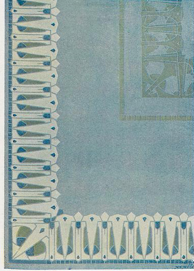
Illustration: Josef Maria Auchentaller. Textile design, 1901.
All of the examples are from 1901 and while having certain similarities and shared experiences that can identify them with the Jugendstil/Art Nouveau movement, they are also very much a significant part of the creative experience that was Auchentaller's own character and individual skill. He was, as is evident, interested in and influenced by Japanese woodcuts. He had a degree of experience in book illustration as he was fairly heavily involved in producing illustrated work for the Ver Sacrum magazine, the official Viennese Secessionist vehicle. At some point in the future, I will produce an article showing some of the work that Auchentaller produced for Ver Sacrum.

Illustration: Josef Maria Auchentaller. Textile design, 1901.
These five examples of Auchentaller's design work are extraordinary, particularly considering that they were produced in 1901. They are so alive with vibrancy and an energy that could easily have placed them alongside some of the best of the textile design work produced in the 1960s and 1970s, more than half a century after they were initially produced. It is always interesting to come across a designer who is able, at times, to step outside of the constraints of their time period, to produce work that can charm and inspire future generations, those who have been untouched by the framework of working decorative movements and eras.

Illustration: Josef Maria Auchentaller. Textile design, 1901.
Auchentaller has managed to step outside these constraints with an ease and familiarity that shows a deep professionalism. His work does create a certain familiarity with the themes of the period, whether that be Japanese aesthetics or Art Nouveau draughtsmanship, but they also show an understanding of the importance that should be placed on individual creative freedom. This could well have developed from his fine art painting perspective, often a discipline that pays little attention to the everyday trials and limitations that are so much a part of the commercial design world.
Whether these five designs ever got past the drawing stage, is hard to tell. So much design work from this period had more to do with aesthetics and the projection of what was possible, rather than what was to be practically available. However, it would be wonderful to think that the European buying public of 1901 did have the chance to go out on a limb and purchase contemporary fabrics that were this vibrant and this adventurous.

Illustration: Josef Maria Auchentaller. Textile design, 1901.
It is certainly vital that design work produced by such talented individuals as Josef Maria Auchentaller, should be seen as both stand-alone moments of inspiration and creative talent, as well being seen as integral to the world of 1901. We should certainly be aware that not everything from that particular era was as heavily bolted down and suffocatingly stifling as we believe. It is often our contemporary world that projects our own viewpoint on to that of another era, and this can be a problem particularly if we are unaware of it. Often the historical era might well have not recognised itself from the perspective given it by future generations. Something to think about as the world we live in continually slips into the past, to be judged and reorganised and reidentified by future generations.
Further reading links: